

Web Design
Creating Animated Accordions with the Details Element and Modern CSS


Editor's note: Originally published March 7, 2025 by Stefan Judis. Updated May 7, 2026 by Matt Abrams to reflect current cross-browser support for
::details-content,transition-behavior: allow-discrete, anddetails[name], and to add a FAQ section.
Accordions are everywhere these days. GitHub has them on their home page right now. Figma ships them, too. I've implemented so many custom accordions that I can't count them.
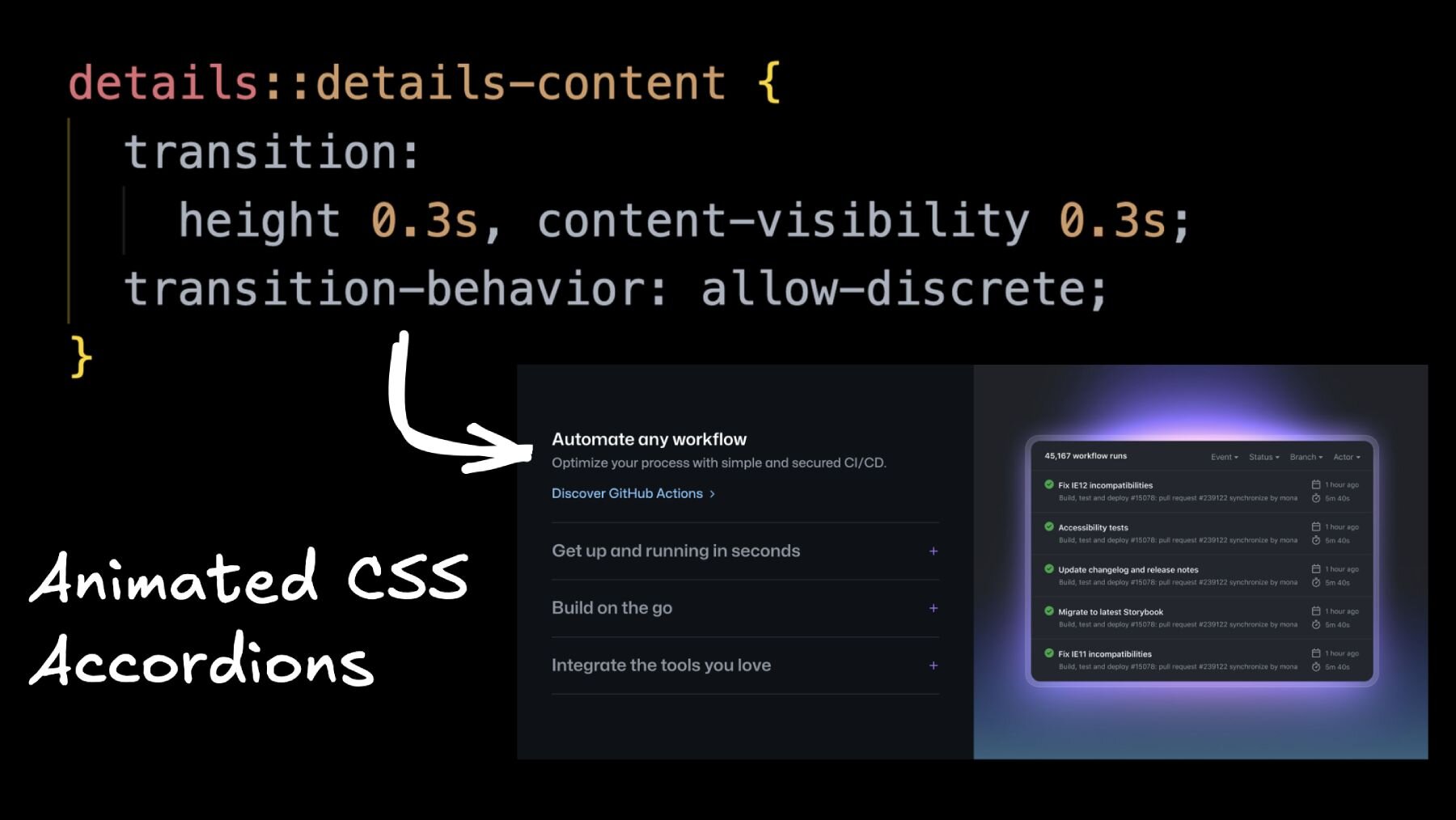
But I must say, today’s accordions are pretty fancy. Here's what you'll find on github.com.
The accordion opens and closes with a good-looking slide animation, and when you toggle the entries, the image on the right column reflects the currently open entry.
How does this work?
JavaScript toggles data attributes and classes, and the good old CSS grid [0fr](https://www.stefanjudis.com/snippets/how-to-animate-height-with-css-grid/) to [1fr](https://www.stefanjudis.com/snippets/how-to-animate-height-with-css-grid/) trick is used to open the details content with a slide transition.
What If I told you you can build the same thing using only HTML and modern CSS?
This example is built without any JavaScript. Without JS? Yep, there’s not a single script element.
Let me show you how to create these fancy accordions using details elements, the ::details-content pseudo-element, the interpolate-size and transition-behavior CSS properties, and the :has() selector.
Can you build an accordion in pure HTML and CSS?
Yes — a modern HTML accordion needs zero JavaScript. The <details> and <summary> elements give you toggle behavior for free, the name attribute groups them into an exclusive accordion, and ::details-content plus transition-behavior: allow-discrete let you animate the open/close transition. The only piece that's still progressive enhancement in 2026 is the height: 0 → height: auto slide, which today only animates in Chromium browsers via interpolate-size (more on that below).

Browser-support note (updated May 2026): details[name], ::details-content (Baseline Newly available since September 2025), and transition-behavior: allow-discrete (Baseline since August 2024) are now supported in current Chrome, Firefox, and Safari. interpolate-size is still Chromium-only — Firefox and Safari users will see the accordion open and close instantly instead of sliding. Everything in this post is safe to ship as progressive enhancement.
Generating markup from your design
Whenever I want to sketch something like this quick 50/50 layout, I reach for Builder's Visual Copilot — the Figma plugin used by 1.25M+ designers and developers to turn Figma frames into clean React, Vue, Svelte, or Angular code. Design something in Figma, install the plugin, import the design into Builder, and off you go.
After Builder generates the component source code, you can either copy and paste it into your editor or go the fancy route and automatically add your codified designs to your project with a single npx command.
You can even “talk” to your components, ask for improvements and refactorings, and export your designs to vanilla web HTML/CSS, React, Vue, and even Swift. It's pretty cool!
But let's get to our vanilla accordion code!
The base setup
After generating some juicy CSS, I cleaned things up a bit (AI ain't perfect yet) and ended up with the following HTML for our new accordion component.
The details elements allow us to show and hide content by clicking on the visible summary element. Additionally, the first element is already expanded by setting the open attribute.
Let's style the details elements and make them a real accordion that only allows one entry to be open!
Removing the details default styling
The details default styles are valuable for quick designs, but we aim for something more polished here. So, where are these triangle markers coming from?
The tiny triangles are defined in the user agent stylesheets. Unfortunately, Chromium/Firefox and Webkit render them in different ways.

Chromium/Firefox defines a display: list-item on the summary element. Similar to li element, these elements come with a stylable ::marker pseudo-element, which can also be adjusted using the list-style property.
To remove the triangles coming from list-style-type: disclosure-open, you can either declare list-style: none to remove all the ::marker elements or change the display property to anything but list-item to avoid rendering list styles at all.

Webkit's details implementation is entirely different. For Apple's browser, we have to reach for the internal pseudo-element selector ::-webkit-details-marker and hide it with display: none.
If we combine both approaches, we end up with the following CSS to remove the details triangles altogether.
Side note: it's not great that major browsers shipped different details implementations for years. The good news is that the details element was an Interop 2025 focus area, and most of the gaps have since closed — Safari 17 normalized the disclosure marker behavior and Firefox 130 added the name attribute for exclusive accordions. Today, the standard ::marker selector works on summary in current Firefox and Safari, so the ::-webkit-details-marker snippet above is mostly a safety net for older WebKit versions.
Let's continue to make the elements a “real” accordion.
How do I make only one details element open at a time?
Set the same name attribute on every <details> element you want grouped. That's the entire trick — no JavaScript, no event listeners, no class toggles. The browser handles mutual exclusion natively, and the feature works in current Chrome, Firefox (130+), and Safari.
Connecting multiple details to build an exclusive accordion
Forcing all these details elements to be open one at a time is a trivial task today because you only need to set the same name attribute on all the elements.
That's it? Yes!
Connecting the details elements with the same name allows only one element to be open at a time. If one details element is opened, the others will be closed.
However, before you slap the same name attribute on all your details elements, be aware that exclusive accordions have accessibility and UX tradeoffs. In many situations, accessing information included in multiple elements is beneficial. For example, if extensive FAQs only allow one question to be open at a time, it will be terrible UX if someone wants to compare paragraphs. I would say that an exclusive accordion is “okay” for this small marketing widget, though.
With these few details tweaks, we implemented the core accordion functionality, and the component started to look like something real after adding some styling.
Animating the details content
At this stage, our details elements are connected and open only one at a time, but they're not looking perfect yet. The hidden content isn't animating or transitioning. How can we make the details content “slide open”?
To do that, we can reach into our CSS magic bag!
::details-content — the expandable/collapsible details content
To animate and transition the hidden accordion content, we need to find a way to select it first.
Wrapping everything in a div might be an option, but this approach often leads to CSS hacks and spacing issues. Chromium browsers ship a new solution to avoid these wrapper elements — ::details-content.
The new pseudo-element lets us select all the content that's not the summary element itself.

For example, if you want to color everything that shows up after clicking the summary element in red, you can set a background color on the ::details-content pseudo-element.

Coloring this new pseudo-element isn't helpful, though, so let's use ::details-content for a sliding transition.
Try Visual Copilot for the layout. Building accordions, marketing sections, and 50/50 hero blocks by hand gets old fast. Visual Copilot — the Figma plugin trusted by 1.25M+ developers — converts your Figma frames into clean React, Vue, Svelte, or Angular components in seconds, then lets you wire them up with
npx. Install it free from the Figma Community.
Animating height with interpolate-size
Now that we can select all the hidden content, you could think of adding an overflow: hidden to transition the height property, but, unfortunately, this won’t work.
We can't animate from a [<length-percentage>](https://developer.mozilla.org/en-US/docs/Web/CSS/length-percentage) value like 0 to an intrinsic size value like auto in CSS. Or can we?
I have a surprise for you!
In Chromium, you can animate from 200px (or other values) to auto by setting [interpolate-size](https://developer.mozilla.org/en-US/docs/Web/CSS/interpolate-size). The allow-keywords value will instruct browsers to do some Math and allow transitioning from specific values to auto, min-content, and other keyword values. This new CSS property is a big deal!
Heads up — interpolate-size is still Chromium-only as of May 2026. Firefox and Safari haven't shipped it yet, so the height slide will degrade to an instant open/close in those browsers. The accordion still works perfectly; it just doesn't animate the height. Treat it as progressive enhancement and you're good.
It should be safe to turn on interpolate-size on the :root element, and all included elements will inherit this new setting.
And now look at this.
This sliding animation isn't perfect yet, but opening the details element looks pretty good already. However, what's up with the closing transition?
Transitioning properties like display or content-visibility with transition-behavior
If you inspect Chromium's details toggle behavior, you'll discover that the closed ::details-content element includes a content-visibility: hidden;. This CSS property prevents our closing slide transition from being visible.

Whenever we close the details element, content-visibility: hidden; is applied to the ::details-content pseudo-element. content-visibility makes any visible effect disappear immediately because there's nothing to transition when the value changes from visible to hidden. The element is just hidden right away.
If you ever wanted to create an exit animation and realized that it wouldn’t work because display: none will hide the element right away, this here is the same problem.
The question is how should browsers transition discrete values (hidden, visible, …)?
The default behavior is to flip the values immediately and ignore the fact that you defined a transition. This is why display: none or content-visibility: hidden are applied immediately.
Luckily, there are new ways to change this behavior! To enable easier transitions, we now have the transition-behavior property.
By setting transition-behavior: allow-discrete we can tell the browser that it's okay to also transition properties that aren't based on numbers. If you allow discrete animations, the values won't be flipped immediately but at the 50% transition mark.
For special cases like display and content-visibility, the values will only be flipped when the entire transition is over. This allows us to transition other properties and set display: none at the end of a transition.
When we turn on transition-behavior for the ::details-content, the browser will only toggle to content-visibility: hidden at the end of the specified transition (0.3s).
And now check this out!
This visual effect might not look like a big deal, but after fifteen years of web development, I'm absolutely amazed by being able to transition height and animate from and to display: none. This is huge!
transition-behavior: allow-discrete reached Baseline in August 2024 and now works in current Chrome, Firefox, and Safari, so this part of the technique is safe to ship without fallbacks.
Now that our accordion looks good, how can we show images depending on the opened details element?
Reacting to DOM changes with the :has() selector
Let's bring in the images in the right column of the accordion component.
Side note: to keep things simpler, I decided to treat the images as “decorative” with an empty alt attribute (alt=””). This way, we can transition opacity to show and hide the images without worrying about their exposure in the accessibility tree.
The accordion should, by definition, always include the same number of details and img elements. Would it be possible to show and hide images depending on which details element is currently open?
It might be a bit adventurous, but I love using :has() for these cases.
Let’s hide all the images with opacity: 0; and scale them up to make them appear with a nice transition when they become visible.
Next, let’s bring in some :has() magic to make the images appear when their details counterpart was opened.
I know, this selector is a mouthful. Let's dissect it!
From right to left: we want to show the image that is a first child (img:nth-child(1)) inside of an .accordion that includes an opened details element that's also a first child (details:nth-child(1)[open]). It takes a moment to wrap your head around it, I know…
However, with this selector, we’re matching the position of the open details element with the visible img element, and we can extend it to cover all the included accordion entries.
And now look at this!
Of course, this approach comes with a significant trade-off. To cover all the cases, you must hardcode a number of entries in your CSS. This obviously isn't great, but I'm okay with shipping a few more selectors to avoid some JavaScript onClick handlers.
And now we're almost done; only one tiny feature is missing.
You might have noticed it: when all details elements are closed, all images are hidden and, unfortunately, we can't prevent the details elements from getting closed.
There's an open HTML specification issue about this problem, but it doesn't seem to have gotten any traction.
To work around this problem, I think it’s fair game to bring in a fallback image. Let's add a .fallback image at the end of the images container…
… and show this image when there are no open details elements inside our .accordion container.
Et voilà!
I might sound like a broken record, but I'm absolutely amazed by all this CSS magic.
Conclusion
This was a wild ride, wasn't it?
In this post, we covered how to animate elements from height: 0; to height: auto;. We transitioned content-visibility from visible to hidden. And we wrote a funky :has() selector to react to all these details elements' opening and closing state.
All these new features show that the CSS evolution is in full swing, and it's enabling us to build things that we couldn’t build before. And I'm so here for building more with less code!
Want to skip the hand-coded layout entirely? Visual Copilot — used by 1.25M+ designers and developers — turns Figma designs into production-ready React, Vue, Svelte, or Angular components in seconds. Design the accordion shell in Figma, export it with one click, and spend your time on the fun CSS instead. Install Visual Copilot from the Figma Community.
Frequently asked questions
What is the HTML details element?
The <details> element is a native HTML disclosure widget. It hides its contents until the user clicks the <summary> child to expand it. No JavaScript or ARIA is required — the browser handles toggle state, keyboard interaction, and accessibility semantics for you.
How do I make a details element animate open and close?
Select the hidden content with the ::details-content pseudo-element, then transition height and content-visibility together. transition-behavior: allow-discrete keeps the element visible during the close animation, and interpolate-size: allow-keywords (Chromium-only as of 2026) enables the height: 0 → height: auto slide. In Firefox and Safari the open/close still works — it just snaps instead of sliding.
Is ::details-content supported in all browsers?
Yes — ::details-content reached Baseline Newly available status in September 2025 and ships in current Chrome, Firefox, and Safari. Older versions of those browsers fall back to the default disclosure behavior with no animation, which is a perfectly acceptable progressive-enhancement story.
How do I make only one details element open at a time?
Give every <details> element in the group the same name attribute. The browser will close the currently open one whenever a new one is opened. This works natively in Chrome, Firefox 130+, and Safari 17+ — no JavaScript, no class toggling, no state management.
Can you animate height: auto in CSS?
You can in Chromium browsers today. Set interpolate-size: allow-keywords on :root and the browser will interpolate between a <length-percentage> value (like 0 or 200px) and an intrinsic size keyword like auto, min-content, or max-content. Firefox and Safari haven't shipped interpolate-size yet, so the rest of the web still uses the CSS Grid 0fr → 1fr trick or max-height for cross-browser height animations.
What does transition-behavior: allow-discrete do?
It tells the browser to animate properties whose values are discrete — like display, content-visibility, or visibility — instead of flipping them instantly. The browser keeps the element visible for the full transition duration and applies the discrete change at the end, which is what makes exit animations and display: none transitions actually look smooth. It's been Baseline since August 2024.
If you have any questions, let us know in the comments, shoot me an email, or tag us on social. And if you want to catch the next article teaching all this cutting-edge webdev stuff, subscribe to our newsletter below.
Until then — talk soon!

Stefan Judis
Share