

Web Development
Unleash the Power of the Platform with These HTML Tags


Get ready to spice up your HTML game with some seriously underrated tags! In this blog post we'll uncover some hidden gems that will make your web development skills shine brighter than a disco ball. From the sassy <details> tag to the snazzy <mark> tag, we'll cover a variety of elements that will take your web pages from drab to fab. So, buckle up and let's explore some exciting new ways to level up your HTML coding skills.
The OG HTML modal - <dialog>
How many times did you reach for a library when you needed a modal?
I know I have so many times…
However, since last year, when Safari and Firefox added support for the <dialog> element, you can finally “use the platform”!
Creating a basic dialog looks something like this:
Whatever is in the <dialog> tag will be hidden from a user. The button in the above code is the means for the user to open the dialog, but in order for this to work we’d need to add a bit of JavaScript:
In the video below, you can see how clicking on the open button opens the modal, and the OK button inside the dialog closes it:
Let’s break it down:
- In order to show the dialog (modal) we use the built in
showModal()function on the<dialog>element. This adds thearia-modal="true"attribute for accessibility purposes as well as provide the ability to close the modal with theEsckey. Furthermore, the initial focus of the user will be set on the first nested focusable element. - The
<form method="dialog">with the<button>(which defaults totype=submit) allows us to close to dialog. Another option is to provide the button with theformmethod="dialog"attribute and remove the method from the<form>.
Styling the backdrop
You can customize the backdrop background using the ::backdrop pseudo element:
Here's what our styles look like in action:

Returning values from the dialog
When using a <form> element inside a <dialog> element, it’s possible to get a return value from the <dialog> close event.
Let’s observe a basic example. This is the HTML:
And the Javascript:
The next video shows how you can open the modal, fill in the inner form, close it using the confirmation button, and get the value of the input outside of it:

For a deeper dive into the intricacies of the <dialog> element, I suggest checking out Adam Argyle’s post on web.dev.
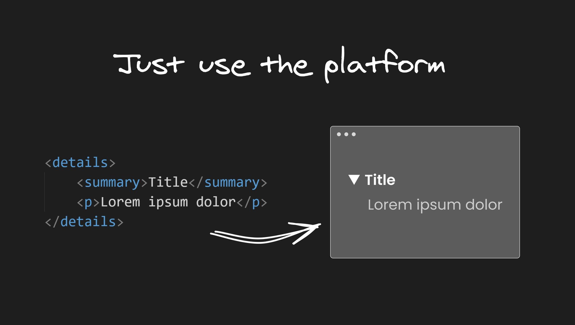
Disclosure widget with <details> and <summary>
In the video below we can see how clicking on the <summary> content reveals the rest:
Show and hide content with no JavaScript?!
Is this magic?!
No. It’s part of the platform.
You can also control the open/close state with JS, but the beauty is you don’t have to. In order to render an open widget, one can add an open attribute to the <details> element.
Notice that we do get some browser default styles like the triangle on the left.
If we wanted to change styles we could use the list-style CSS property to change the triangle and the details[open] selector to change the content styles based on the open state.
Check out a working example of these elements below:
I will be the title of the content underneath
Whatever is written here will be hidden by default
Native autocomplete with <datalist>
Did you know that your browser has an element that basically gives you an autocomplete with no JavaScript?
Using <datalist>, <option>, and an <input> element is all you need!
Check it out:
This will show us an input in which, when we start typing, will give us suggestions:
The bonus is that we get keyboard controls for the suggestions, and easily navigate through the list.
Value bars with <meter> / <progress>
<meter> is an HTML element that allows you to display a value within a predefined range. It's often used to show progress bars or levels. It accepts the following attributes: value, min, max, low, high, and optimum.
With these attributes, we can indicate to the browser what the color of the bar would be, depending on the values.
This is best understood through an example. Let’s take this fuel level example:
What you put between the opening and closing <meter> tag does not display.
This results in the a green bar in the browser:
The bar is green because our value (70) is higher than the high attribute, therefore, we get green.
If we change the value to something lower than the high value, for example, 60 our bar will change its color to yellow, without needing to change any CSS:
And if we set the value attribute to lower than the low (33) value, that would result in a red bar:
Pretty neat, no?
Flipping colors
Now, let’s say we want to display something that has the opposite definition, meaning, when we have more, it’s bad, and when we have less, it’s better.
For example, let’s say we want to display how much space we have left on a hard drive. In order to do this, all we have to do is define our attributes opposite to what we did with the fuel example:
This will result in a red bar:
When we have more disc space (value is less than low, for example 650) we’ll get a green bar:
Using <progress>
The <progress> element differs from <meter> only slightly:
- It only has 2 attributes: max + value (the minimum value is always 0).
- It only displays one color out of the box.
Here’s a simple example:
However the one cool feature about this element, is that if you omit all of the attributes, you get an animated loading bar with a blue ellipsis moving back and forward:
When using this element, just remember that there are some accessibility concerns.
Highlight text with <mark>
As the name suggests, <mark> can be used to mark/highlight text within a block of content. For example:
Will render with the words in the <mark> tag as highlighted yellow:
It is a period of civil war. Rebel spaceships, striking from a hidden base, have won their first victory against the evil Galactic Empire. During the battle, Rebel spies managed to steal secret plans to the Empire's ultimate weapon, the DEATH STAR, an armored space station with enough power to destroy an entire planet.
One thing to note about accessibility is that in order for screen readers to announce “marked” content, you need to use CSS in combination with :before and :after pseudo elements, like so:
Responsive image sources with <picture>
One of the most underrated HTML tags is the <picture> element, which allows you to serve different images based on the user's device and screen size. This can greatly improve the loading speed and user experience of your website.
To use the <picture> tag, you just include multiple <source> elements within the tag, each with a different image source and media query to determine when it should be displayed.
Here's an example of how to use the <picture> tag:
In this example, the browser chooses the appropriate image source based on the user's device and screen size. The first <source> element is used for devices with a minimum width of 1200 pixels, the second for devices with a minimum width of 768 pixels, and the third for all other devices.
If the browser does not support the <picture> tag, it will fallback to the <img> element (although, all major browsers have supported this for a few years now).
By using the <picture> tag, you can optimize your images for different devices and improve your website's performance and user experience.
Below we can see this in action, when we resize the window, the browser renders a different image:
For more about image optimizations, I suggest checking out “Optimal Images in HTML” a post that Steve wrote a while back.
Fun with math and science (elements)
MathML is an XML based language for describing mathematical notations.
The gist of it is that there are many elements that you can use to display equations and “sciencey” stuff, in case you need to.
I will not dive in too deeply here, as I probably lack the math knowledge to actually explain anything significant.
It’s just pretty cool to know that you can use the <math> element with a variety of other sub elements to do something like this:
Which would render this:
The infinite sum is equal to the real number .
Yeah science!
With the <sub> element you can do stuff like this:
Which would yield this:

Which would render this:

But you could also use <sup> to add ordinal numbers, like so:
Which gives this result:

Or superior lettering (not sure what that is for, but you can), like for certain French abbreviations (apparently, as I’ve learned from MDN):
That would render:

Moaaaaaar elements!
- You can show text diffing with
<del>and<ins>. - You can use
<kbd>to show textual user input from a keyboard, voice input, or any other text entry device. <abbr>is used to provide an abbreviation or acronym for a term.- Use
<cite>to, well, cite creative work. - The
<bdi>element can help contain text when you need to isolate bi-directional text, for example mixing a left-to-right (LTR) language with a right-to-left (RTL).
Conclusion
In conclusion, HTML has a wide variety of elements that can help you create rich and interactive web pages. From the lesser-known elements like <dialog> and <picture>, to the more commonly used elements like <div> and <p>, each element provides unique functionality that can help you create a great user experience on your website. By taking advantage of these elements, you can make your website more accessible, more performant, and more engaging for your users.
Happy coding!
Share