

Web Development
React Intersection Observer - A Practical Guide
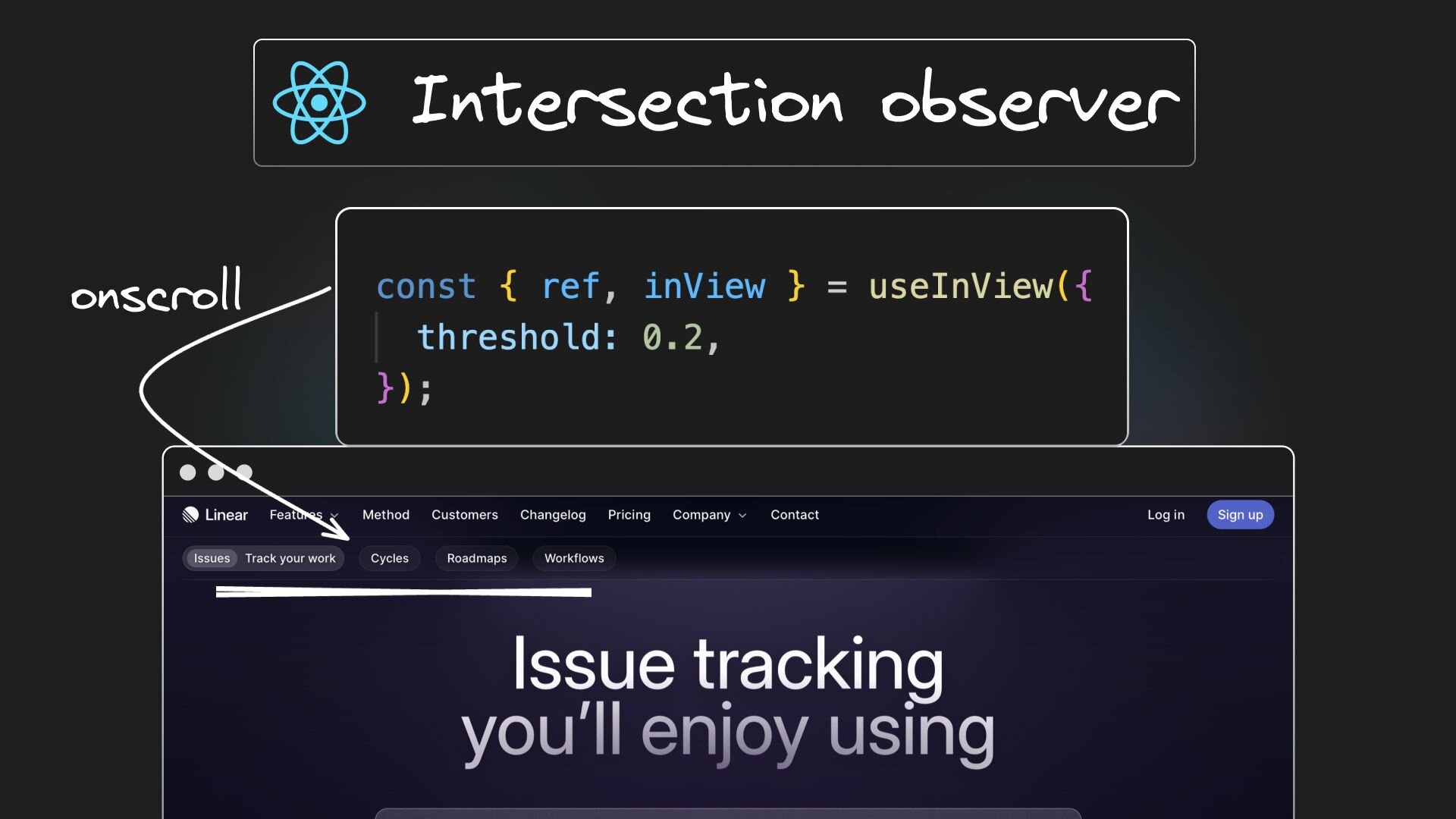


In this blog post, we'll explore how to use the Intersection Observer in a React app. We'll recreate the appealing secondary nav animations found on Linear's landing page — the reveal and highlight animations that occur on scroll. This is a fantastic way to enhance user experience and add a polished look to your website.
Setting up a Vite React app with Tailwind CSS
First, we create a Vite React app using the command npx create vite app, selecting React as the library. Next, integrate Tailwind CSS by following the simple six-step process outlined in the official Tailwind CSS documentation.
Once setup is complete, launch the development server with npm run dev and navigate to localhost:5173 to see your app in action.
Generating the markup

The default Vite React app provides basic markup, but we're aiming for a design closer to Linear's landing page. Manually coding this from scratch is time-consuming, but AI can help us achieve 80% of the goal without as much effort.
Starting with this mockup in Figma, I used the Builder.io Figma plugin to convert the design into React + Tailwind CSS code using Visual Copilot.
I've also added markup for the secondary navbar and content sections, which can be found in the LandingPage.tsx file.

The primary and secondary navbars are not aligned, but this doesn’t impact our learning about the Intersection Observer.
Understanding the Intersection Observer
Before implementing the animation, let's understand the Intersection Observer API and its importance for our task.
The Intersection Observer is a JavaScript API that enables actions based on the visibility of elements within the viewport. It's highly efficient for detecting when an element becomes visible or hidden, making it ideal for scroll-based animations.
Here's a basic code example:
The callback function is triggered when the target element enters or exits the visible part of the screen.
Using the react-intersection-observer package
To simplify the implementation of the Intersection Observer in a React app, we'll use the react-intersection-observer package. Install it in your project with the command:
This package offers a straightforward and React-friendly approach to using the Intersection Observer API.
Implementing the reveal on scroll animation
Let's revisit the animation we're aiming to replicate:
To implement this, we need to focus on two aspects:
- Detecting when the wrapper of the four sections comes into view.
- Transitioning the navbar from hidden to visible below the primary navbar.
In the LandingPage component, start by using the useInView hook from react-intersection-observer.
The hook accepts a threshold option, indicating the percentage of visibility before triggering. It returns a ref and a state inView indicating whether the element is in view.
Assign the ref to the DOM element you want to monitor, which in our case is the section wrapper element.
Use the inView property to conditionally apply classes to the secondary navbar, controlling visibility and transition effects:
When you scroll down to the section wrapper element in the browser, the secondary navbar will reveal itself.
Implementing the highlight on scroll animation
The next step involves expanding and highlighting the secondary nav link based on the section in view:
To achieve this, we focus on two aspects:
- Detecting when each individual section comes into view.
- Expanding and highlighting the link corresponding to the section in view.
Detecting individual sections
Instead of useInView, we use the InView component from react-intersection-observer for detecting the section in view.
This approach allows us to specify the component once within the map method, rather than invoking the hook four times (once for each section).
Update the section wrapper element as follows:
For the InView component, we specify three props: onChange (a callback function for when the in-view state changes), threshold (a number between 0 and 1 indicating the percentage that should be visible before triggering), and key (for list rendering).
Tracking current section in view
To track the current section in view, maintain a state updated by the setInView function assigned to the onChange prop. This state updates to the id of the section in view.
Highlighting the nav link
When a section is in view, we expand the corresponding nav link to accommodate two items and change the background color. For managing the width change, we maintain separate open and closed state widths. This approach allows us to dynamically adjust the width of each nav link, enhancing the visual feedback as the user scrolls through the sections.
Update the state of each secondary nav link based on the visibleSection state, and adjust the background color accordingly.
And there you have it — our scroll based animation using Intersection Observer with React and Tailwind CSS. Here’s the final code.
Share