

Web Development
Tailwind CSS Tips and Tricks Worth Knowing


Updated: 7/15/2023
In this blog post, I’m not going to say why you should use Tailwind. I’ve covered the whole debate enough in a previous post.
This time I’ll explore some Tailwind tips that can significantly enhance your web development experience. Whether you're a beginner or an advanced Tailwind user, I hope you find something useful.
Let’s go!
Dynamic utility classes
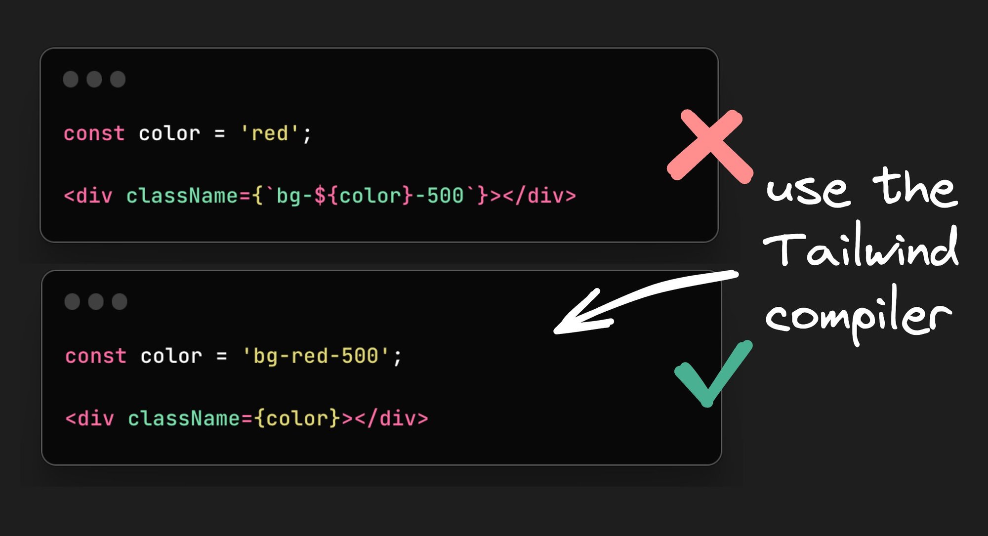
Tailwind purges classes that are not being used. This is how it's able to have so many features and still keep our CSS bundle size small. So, if you want to use dynamic class names, you need to have all the class names you want written somewhere in your code. This is in order for Tailwind to be able to statically analyze your code.
For example something like this won’t work:
That is because there is no way for Tailwind to find it’s classes statically. Having bg-${color}-500 needs to be evaluated in runtime. However, if we do use the full class names, the Tailwind compiler can make it work:
Using Tailwind inside CSS
There are some times where we are forced to use CSS for our styles; for example, when using a third-party library. We can stick with the Tailwind colors by using the @apply directive or the theme function. Let’s have a look at a code example:
Arbitrary values
Another way to write pure CSS inside Tailwind is with brackets ([]). This is what is referred to as “arbitrary values”. You can do things like this:
What more is that you can use the theme function as well:
In case you want to reference a CSS custom property, there’s no need to use the var keyword (since v3.3). You can simply pass in your CSS variable as an arbitrary value:
Also, you can easily define a custom variable like so:
Group and peer utility classes
Tailwind allows us to change the style of an element based on its state with helper classes such as :hover, :checked, :disabled, :focus, and more (you can find them all here). So it’s easy for us to do something like this:
The result would be the below:
What if we want to change the style based on the state of another element? This is where the peer and the group utility classes come in handy.
Style based on parent state
For instance, we can change the style of child elements when the parent is hovered by turning the parent into a group and using group and group-hover: utility classes:
Which would result in the following:
There are more helper classes to modify the child elements and this works for almost every pseudo-class modifier (here’s the full list).
Style based on sibling state
The peer class modifier can be used to style an element based on the state of it’s sibling. You can use the peer-{modifier} where {modifier} can be any pseudo-class modifier.
Here’s a simple example:
When we hover over “sibling 1” the text will change the “sibling 2” element:
You can name names
Both with the group and peer you can give unique names to differentiate groups and peers.
This is done by adding /{name} to either helper classes, for example:
Visually build with your tailwind components
You can register components from within your code straight into Builder.io’s Headless Visual CMS and allow non-devs to drag and drop your custom components in the Builder UI.
To do so, you need to have a Builder account first. Then, follow the docs to get set up.
Once you have finished setting up and you’ve connected to Builder, create a component in your repo using Tailwind.
Let’s assume you’re working with Next.js. We can create a new component:
Then we register the component to Builder:
And then we can just drag and drop our component into our app via the Builder UI, like in the video shown above, where the left side is Builder and the right side is our connected Next.js app.
Animation utility classes
Tailwind has some very useful and easy-to-use animation utility classes. For example, we can add the transition color class and set a duration of 300 milliseconds to create a smooth color change effect on hover. We can also pass an animation curve and a delay for the animation:
Almost any animatable property is available to you (for a full list see here).
Other than that, there are premade animations available like: animate-spin, animate-ping, animate-bounce, and animate-pulse.
Responsive designs
Tailwind is a mobile-first framework, which means that un-prefixed utilities take effect on all screen sizes, while the prefixed utilities override the styles at the specific breakpoint and above. This helps write your CSS mobile first, as you need to define from small the larger screens.
Let’s say we want a grid of images or videos. We want our design to be one column on mobile, and then on larger screens be 2 columns, and on desktop have 3 columns, like so:
This is how we would write it:
Custom min and max utility classes are available as well for more dynamic use cases. Furthermore, you can add custom breakpoints into your tailwind.config.js configuration file.
Editor extensions
The Tailwind CSS Intellisense extension for your IDE is one of the main reasons why Tailwind is so pleasant to use. It auto-completes the class names for you, shows you the color being used, and explains the details of the class when you hover over it.
Other than that, you can get Prettier sorting your classes with the Tailwind Prettier plugin. And one more quality-of-life extension that might help your eye sores from a long list of classes is Tailwind Fold.
Creating custom utility classes
We can use the Tailwind configuration file to create our own custom utility classes. This is very useful if we want to use a specific style in multiple places in our app. So, if we want to add another box shadow class for example, this is what we’d need to do:
Then we could use it in our code:
Anything in Tailwind can be extended or overridden.
Creating custom Tailwind plugins
If we want to be able to choose the color of a custom utility by passing the color, we need to make our own custom Tailwind plugin. This is a bit advanced, but it allows us to create very flexible and reusable utilities.
Let’s reuse our neon shadow example. To add that ability to it, we can go to tailwind.config.js and define our plugin:
Then we can use our newly created utility classes straight in our HTML (or JSX):
Notice that we can change to any color in the Tailwind palette we want:
Importing Tailwind colors as an object
We can import Tailwind colors as an object inside JavaScript. This can be extremely useful if we want to use the Tailwind colors to create our own custom theme, or add another name to the color palette.
For example, we can create a primary color that will be added as a class:
Using variants
A common use case when building components is having some sort of base or default style that can be overridden, by passing a class or a prop.
The tailwind-merge package is very useful to deal with this. It allows us to pass the base classes as the first parameter and the class name as the second parameter, ensuring that our class name overrides the default class (for a deeper dive as to how this works, see this video).
Here’s an example:
Bonus: with Class Variant Authority
CVA is a package to help you create variants in a more elegant way. To make it work with tailwind-merge we can do the following:
Easy gradients
You can create complex gradients using gradient color stops. To do so we can use the bg-gradient-to- class and combine it with t (top), r (right), b (bottom), and l (left). We can also state corners with tr (top-right), bl (bottom-left), etc.
And then we can combine: from, to, and via to make some stunning gradients.
Let’s have a look at some examples:
The rendered output would be a gradient that starts with indigo and fades to transparent:

To set the ending we can use the to-:
That would render a gradient that starts with indigo and fades to pink:

To add pizzaz we can control which color is in the middle by using via between:
That would render an almost rainbow gradient, as such:

Truncate your text easily
Another nifty utility class is line-clamp, which allows you to truncate multiline text by simply adding a number such as line-clamp-3:
The rendered result will put an ellipsis after 3 lines of text:

Styling the un-styleable
Styling things like <input type="checkbox"> has been notoriously hard. No more, with the accent-{color} modifier:
Container queries
One of the new CSS features that a lot of folks are rightfully excited about. They allow applying styles based on the size of the element itself. There's a plugin to start using them now in Tailwind called @tailwindcss/container-queries.
After adding this plugin to your project, an element can be mark with @container and children can use variants like @sm and @md:
Conclusion
And that's it! These are just some of the many tips and tricks available to you when using Tailwind CSS. With its wide range of utility classes and responsive design capabilities, the possibilities are endless. So get creative, have fun, and don't be afraid to experiment with new styles and designs. With Tailwind CSS, you can create beautiful and functional websites with ease. Happy coding! 🚀
Share